library(tidyverse) # who doesn't want to be tidy?
library(gt) # for nice tables
library(treemap) # for treemap
library(d3treeR) # for interactive treemapsTidyTuesday 36: Visualizing Worker Demographic Information with Treemaps
Data-Viz
R
R-code
Code-Along
treemap
TidyTuesday
d3treeR
interactive
Using treemap and d3treeR to create static and dynamic treemaps
Intro/Overview to TidyTuesday 36: Union Membership in the United States
This week’s TidyTuesday presents data taken from the Union Membership and Coverage Database from the CPS (Unionstats.com) created by Barry T. Hirsch, David A. Macpherson, and William E. Even. This database contains data about the wages of union and non-union workers from 1973 until today.
There is a companion paper:
Macpherson, David A. and Barry T. Hirsch. 2023. “Five decades of CPS wages, methods, and union-nonunion wage gaps at Unionstats.com.” Industrial Relations: A Journal of Economy and Society 62: 439–452. https://doi.org/10.1111/ irel.12330
I highly recommend reading the paper as it clearly illustrates the challenges of working with real-world data collected by 3rd parties. The source data is government survey data. For some key questions, a third of respondents didn’t answer. Imputation was performed (but not always noted) by the government agency, but in such a way that it obscured the trend about wage gaps between union and non-union labor. (Likely, the survey was designed to study something else, and the imputation method was fine for that question. Some years did not even ask about participation in labor unions.) The survey also didn’t always collect detailed information about the salary of the highest earners, simply marking them as being “above the cap.” The paper details numerous such issues and explains how the data was handled to standardize the results over the five decades the database covers. It is a beautiful example of how to handle messy data.
Today, I will make two types of treemaps using some of the demographic data from this dataset. A treemap is a way of visualizing how various parts relate to the whole. The demographic data seems all related and could be viewed in a treemap form. So, I’m going to pull that out. The UnionStats website also warns, “Note: CPS sample sizes are very small for some cells. Use such estimates cautiously.” So, we can use the treemap to visualize that caution for the demographic subsets.
Setting Up
Loading Libraries
Loading Data
This week’s data is not loaded in the usual way! While the TidyTuesday page was up on Monday, the TidyTuesday package insisted the data was unavailable by either week number or date. So, instead, I loaded it directly from Git Hub.
demographics <- readr::read_csv('https://raw.githubusercontent.com/rfordatascience/tidytuesday/master/data/2023/2023-09-05/demographics.csv')
wages <- readr::read_csv('https://raw.githubusercontent.com/rfordatascience/tidytuesday/master/data/2023/2023-09-05/wages.csv')
states <- readr::read_csv('https://raw.githubusercontent.com/rfordatascience/tidytuesday/master/data/2023/2023-09-05/states.csv')
I will work with the 2019 data, since it is recent and pre-pandemic. The demographic data is found in the facet variable and other subcategories (public vs. private sector, industry, etc.).
wages_2019 <- wages %>%
  filter(year == 2019)

wages_2019 %>% select(facet) %>% gt()| facet |
|---|
| all wage and salary workers |
| construction |
| all wage and salary workers |
| wholesale/retail |
| all wage and salary workers |
| all wage and salary workers |
| all wage and salary workers |
| public administration |
| private sector: all |
| private sector: nonagricultural |
| private sector: construction |
| private sector: manufacturing |
| public sector: all |
| public sector: federal |
| public sector: state government |
| public sector: local government |
| demographics: less than college |
| demographics: college or more |
| demographics: male |
| demographics: female |
| demographics: white male |
| demographics: white female |
| demographics: black male |
| demographics: black female |
| demographics: hispanic male |
| demographics: hispanic female |
Interestingly, the overall data (“all wage and salary workers”) appears 5 times.
Selecting the Demographic Data
I will view how the sample size changes over the sex/race demographics. I’m going to use a treemap to do so.
First, I will select the rows where the facet has “demographics” or the “all wage and salary workers”. This is done with str_detect from the stringr package.
wages_2019_demo <- wages_2019 %>%
  filter(
    str_detect(facet , "demographics") == TRUE |
      str_detect(facet, "all wage and salary workers") == TRUE
  )
Remove the first four rows- this contains duplicate information about all workers. The college data is also removed since it isn’t related to the other demographic data in a way we can define.
wages_2019_demo2 <- wages_2019_demo[5:15,]

wages_2019_demo2 <- wages_2019_demo2 %>%
  filter(str_detect(facet , "college") == FALSE)

wages_2019_demo2 %>% gt()| year | sample_size | wage | at_cap | union_wage | nonunion_wage | union_wage_premium_raw | union_wage_premium_adjusted | facet |
|---|---|---|---|---|---|---|---|---|
| 2019 | 94818 | 28.09587 | 0.05071279 | 31.70222 | 27.64805 | 0.14663510 | 0.14290078 | all wage and salary workers |
| 2019 | 48157 | 31.31306 | 0.07093566 | 34.02119 | 30.96146 | 0.09882383 | 0.17838623 | demographics: male |
| 2019 | 46661 | 24.64259 | 0.02903222 | 28.99576 | 24.12817 | 0.20173885 | 0.10255232 | demographics: female |
| 2019 | 40352 | 31.72107 | 0.07324656 | 34.46735 | 31.36370 | 0.09895673 | 0.17714998 | demographics: white male |
| 2019 | 37864 | 24.57163 | 0.02741190 | 28.91303 | 24.06818 | 0.20129693 | 0.09296709 | demographics: white female |
| 2019 | 3607 | 23.72498 | 0.02696504 | 30.11012 | 22.74304 | 0.32392681 | 0.17447826 | demographics: black male |
| 2019 | 4577 | 21.96607 | 0.02158116 | 26.77524 | 21.29592 | 0.25729427 | 0.14210089 | demographics: black female |
| 2019 | 6897 | 22.11324 | 0.02291996 | 30.18838 | 21.20103 | 0.42391109 | 0.24975224 | demographics: hispanic male |
| 2019 | 5947 | 18.81279 | 0.01247475 | 25.42001 | 18.14904 | 0.40062550 | 0.15435517 | demographics: hispanic female |
Let’s remove “demographics:” and the all jobs data and then split the facet description into race and sex. I’m replacing "demographics: " with an empty string using str_replace.
From tidyR, separate() does a pretty good job of guessing how to split the data, but you can always give it the pattern to split on. Note that separate() has superseded in favour of separate_wider_position() and separate_wider_delim(), but it still supported.
wages_2019_demo3 <- wages_2019_demo2[2:9,]

wages_2019_demo3 <- wages_2019_demo3 %>%
  mutate(facet = str_replace(facet, "demographics: ", "")) %>%
  separate(facet, c("race", "sex"))
Warning: Expected 2 pieces. Missing pieces filled with `NA` in 2 rows [1, 2].wages_2019_demo2 %>% gt()| year | sample_size | wage | at_cap | union_wage | nonunion_wage | union_wage_premium_raw | union_wage_premium_adjusted | facet |
|---|---|---|---|---|---|---|---|---|
| 2019 | 94818 | 28.09587 | 0.05071279 | 31.70222 | 27.64805 | 0.14663510 | 0.14290078 | all wage and salary workers |
| 2019 | 48157 | 31.31306 | 0.07093566 | 34.02119 | 30.96146 | 0.09882383 | 0.17838623 | demographics: male |
| 2019 | 46661 | 24.64259 | 0.02903222 | 28.99576 | 24.12817 | 0.20173885 | 0.10255232 | demographics: female |
| 2019 | 40352 | 31.72107 | 0.07324656 | 34.46735 | 31.36370 | 0.09895673 | 0.17714998 | demographics: white male |
| 2019 | 37864 | 24.57163 | 0.02741190 | 28.91303 | 24.06818 | 0.20129693 | 0.09296709 | demographics: white female |
| 2019 | 3607 | 23.72498 | 0.02696504 | 30.11012 | 22.74304 | 0.32392681 | 0.17447826 | demographics: black male |
| 2019 | 4577 | 21.96607 | 0.02158116 | 26.77524 | 21.29592 | 0.25729427 | 0.14210089 | demographics: black female |
| 2019 | 6897 | 22.11324 | 0.02291996 | 30.18838 | 21.20103 | 0.42391109 | 0.24975224 | demographics: hispanic male |
| 2019 | 5947 | 18.81279 | 0.01247475 | 25.42001 | 18.14904 | 0.40062550 | 0.15435517 | demographics: hispanic female |
Now, I don’t need male and female total rows except to check the numbers (the first two rows). I see the subcategories don’t add up to these upper-level demographic categories. Male + female does equal the total number of workers (“all wage and salary workers”), but the individual subgroups of male and female don’t add up to the totals (hispanic male + white male + black male > male). One explanation is that some survey participants chose to identify in multiple categories. This data isn’t the greatest choice for a treemap since some participants will appear in multiple boxes, but I will proceed with the graph.
Remove the first two rows. Treemap will generate the totals using the sample size from each subcategory.
wages_2019_demo3a <- wages_2019_demo3[3:8, ]Making a Treemap with the treemap package
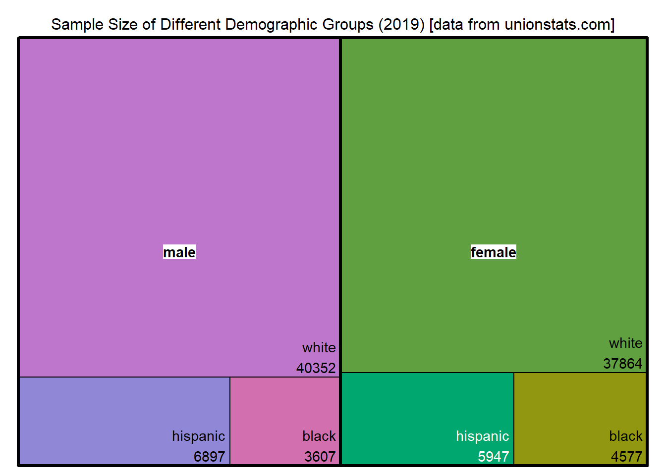
Using the treemap package as recommended by The R Graph Gallery. There isn’t a built-in way to display the numerical data, so I will construct that as a separate field. It will consist of the subgroup name, a new line, and then the sample size for that subgroup.
I’m keeping many of the defaults for the treemap. You can specify the palette and details about how the blocks will be arranged, but I’m not tweaking those parameters. The package also doesn’t have a caption or subtitle option, so I’m including the data source in the title.
# Make the label with the subgroup and sample size.
wages_2019_demo3a <- wages_2019_demo3a %>%
  mutate(race_sample_size = paste(race, sample_size, sep = "\n"))

# Making the tree map
treemap(
  wages_2019_demo3a,
  index = c("sex", "race_sample_size"),
  vSize = "sample_size",
  type = "index",
  bg.labels = c("white"),
  align.labels = list(c("center", "center"),
                      c("right", "bottom")),
  title = "Sample Size of Different Demographic Groups (2019) [data from unionstats.com]",
  fontsize.title = 12
) 
Interactive Treemap with d3treeR
I can also make an interactive treemap using the d3treeR package. Like many of the other interactive graphs I’ve created, this is a wrapper for a javscript module and can be additionally interacted with using htmlwidgets.
This package needs to be installed via devtools::install_github("d3treeR/d3treeR"). There is a similarly named package on CRAN (d3Tree), but that isn’t what you need.
Here, I made a new treemap without the numerical data label I made for the static map. The d3tree2 function will automatically display that information as you hover over the boxes.
inter <- d3tree2(
  treemap(
    wages_2019_demo3a,
    index = c("sex", "race"),
    vSize = "sample_size",
    type = "index",
    bg.labels = c("white"),
    align.labels = list(c("center", "center"),
                        c("right", "bottom"))
  ),
  rootname = "Sample Size of Different Demographic Groups (from unionstats.com)"
)
Weirdly, when you run the above codeblock, the static map created by the treemap call is displayed, even though the interactive map isn’t. This can be mitigated by setting the output of the code block to false if you are using markdown or quarto.
And then you can display the interactive map.
interConclusions
Some demographic subgroups do represent under 5% of the total workforce surveyed. For the race category, it appears that some respondents chose more than one category, which could be a problem for imputed data based on matching demographic characteristics.
Citation
BibTeX citation:
@online{sinks2023,
  author = {Sinks, Louise E.},
  title = {TidyTuesday 36: {Visualizing} {Worker} {Demographic}
    {Information} with {Treemaps}},
  date = {2023-09-05},
  url = {https://lsinks.github.io/posts/2023-09-05-TidyTuesday-Labor/labor.html},
  langid = {en}
}
For attribution, please cite this work as:
Sinks, Louise E. 2023. “TidyTuesday 36: Visualizing Worker
Demographic Information with Treemaps.” September 5, 2023. https://lsinks.github.io/posts/2023-09-05-TidyTuesday-Labor/labor.html.